Saturday 9 January 2010

Evaluation Questions

1. In what way does your media product use, develop and challenge forms and conventions of real media products?


For more detail on the ways in which we used, challanged and developed forms and conventions for our promotional advert and digipak click this link http://graveneymedia3666.blogspot.com/2010/01/analysis-and-evaluation-of-digipak.html

2. How effective is the combination of your main product and ancillary texts?


3. What have you learnt from your audience feedback?


To view the recorded audience feedback we gathered, click here http://graveneymedia3666.blogspot.com/2010/01/audience-feedback.html

4. How have you used new media technologies in the research, planning, construction and evaluation stages?

During my research I found a lot of help to be gained from the use of the internet and my computer. Through fast search engines such as ‘Google.co.uk’ I was able to search for and locate exactly what I was looking for with ease, for example when looking for background information on the artist ‘KT Tunstall’ I typed in the keywords ‘KT, Tunstall, Suddenly, I, see’ into the search box which brought up a host of results and I found what I was looking for(The genre her music was classed as) quickly and efficiantly from the result for the website Last.fm which is a popular music site, I later referred to this site on numerous occasions for similar queries on other bands. Having such fast search results like this allowed me to be a lot more productive with my time and able to do a lot more work in a shorter space of time and gave me more time to focus on the rest of the project.

When trying to establish what the typical conventions are that are used in ‘Indie’ Music videos I used the websites YouTube, Yahoo Music Station and Google video to search for and view music videos of this genre, to do this I used the facility of looking at videos in terms of their genre which ranged from metal to r&b; Becuase of this I was able to find out that Indie videos usualyy have a fast cutting pace and have frequent close ups of the artists, they also usually have a strong narrative running with the video, we encorporated all of these into our video. Searching by genre also helped as I was not only limited to looking at the bands I was familiar with but could get a broader, more accurate idea of what the conventions were for use with our own video.

While streaming the music videos in the online players I found it very useful in the way I could pause, rewind, fast forward or watch as many times as I wanted. This enabled me to go back and pick up on things that I may have missed on a first viewing, say on a music television channel such as MTV2 it also saved time through not having to wait for commercials.

I was also able to use Windows Vista’s, Snipping Tool, application to capture specific areas of a moment on screen and as the JPEG file format which is the perfect format to use when uploading pictures to my blog. Having this feature also meant I as able to capture preicse images from a video and email them to my group members, for example I found a scene from a music video set in a forest which I showed them and we all liked. I also used this while analysing all the music videos but especially when looking at the song Misery Business by the band Paramore, I saved numerous images from the video for further analysis so I could make my point clear with examples of how the video portrayed typical American High school stereotypes such as the bullies and also the strong female lead singer.

When we were looking for a band to use, I used the worldwide social networking site Myspace.com, which is also famous for its music section which allows bands, signed or unsigned to publish their music for online streaming as long as it’s in the MP3 file format. This proved helpful as it saved a lot of what would have been wasted time contacting bands with copy write music where the likelihood they would refuse our request.

I again searched for bands via genre and set it to indie/rock, this saved a lot of time as I didn’t have to go through lots of bands that weren’t of the genre I was looking for. I sorted my results by popularity which gave me the list of most popular bands in this section, from this I discovered several bands, one of which being ‘Futures’ where I was able to listen to their song ‘16’ and send a message to the band using MySpace’s inter-messaging facility, this saved us time having to find an alternative contact method and also allowed us to keep an easy track of messages sent and received by possible bands.

During all staged of production my group needed to be able to keep in constant contact with each other and have the capabilities to send and receive files within the school network, To achieve this we used the website ‘Fronter’ which is a personal login space where members of a school are linked and can share files. This helped us a lot as our normal everyday email accounts such as ‘Hotmail’ cannot be accessed from the school, I also used my fronter email address to sign up and create a YouTube account, my blog, SlideShare and more.

When blogging I preferred to use my home computers word processing software, Microsoft Word 2003 as the formatting options were a lot simpler and more familiar than that of blogger. To publish my posts in the same format and layout, like I did with the analysis of KT Tunstall’s music video to Suddenly I see, I used the website SlideShare.net which is a document hosting website where users can share document, slideshows etc with the word in exactly the same way it is presented in their software, the site best handles documents with the file extension ‘.doc’ which is what my software saves documents as which was helpful, it kept all images and text in the same places this saved me having to reposition everything if pasted into blogger.
Once my file was uploaded I was able to embed the document into a blog post on my blog page using HTML(HyperText Markup Language) code; the code of which is provided when you upload documents.

When researching music adverts in magazines I found myself in possession of hard copies of some which I needed to have as an electronic copy. For this I used my flatbed scanner at home to scan the images in, in high quality onto my computer and then upload it to fronter where I could have access to them wherever, this helped as I didn’t have to worry about being too careful with the original in fear of it getting scrunched up or torn. I could also using my photo viewing software to zoom up on the images and see more close up details usually undetectable at a glance, this helped as I was able to put in more detail into our magazine advert especially on the forest so when examined closer the detail can be seen.
I also had some digipaks which I needed to have pictures of on my computer, I tried to scan them in, but failed, due to the thickness of the albums letting in light inside the scanner and disrupting the picture, to resolve this I used my compact digital camera, Kodak M340, to take photographs of the albums such as one by the band ‘System of a down’ entitled’ Mesmerize’ and have them on the computer again in high quality ready for analysis. Having virtual copies meant I could take the pictures with me so that I could study the layout of them in depth wherever I was and also show my group what I had found so we could all confer with each other, we were then able to make a group decision on how we wanted the digipak and magazine advert to be.

When constructing we were able to get feedback on certain parts of the video in advance so that we could edit it early, for example we uploaded two versions of the landlord scene from the video to YouTube and asked for feedback which we received, having it online enabled us to get a diversity of opinions and not just those of the people we ask who could be biased, we were also able to show the scenes to anyone wherever we had an internet connection allowing us to get feedback wherever. Also when we gathered feedback online for our main video we didn’t ask a specific question on the video, this meant that misinterpretation of the question couldn’t happen and that we could gather feedback from all aspects of the video for example some of the feedback we got refereed to not only the narrative but the performance and end editing as well.

During the construction process I used the new media technology of different file formats to allow portability of my product, in this case being able to export video clips from iMovie in an .mp4 file format which is what iPods can play. This enabled me to see what I’ve got went out filming or what we needed to get, for example it helped us when we were out filming I had the animatic on my iPod which we could use to give an idea of timings for scenes in the video and as a sort of video style shot list, this sped up the filming process and made the construction a lot smoother. I was also able to export the video as a .3gpp and then use Bluetooth technology to transfer it wirelessly to my mobile phone, being wireless it saved the hassle of cables and installing drivers.

In my evaluation stage I have been again able to use my compact camera to record video of myself with sound answering the three other evaluation questions this helped me express the evaluation a lot better and when editing it enabled me to input screenshots so I could easily refer to specific scenes in the video or other medias directly, for example when I talked about the “I Wish” signs I was able to show an example.

On the whole all the the new media technologies I used with my production proved to be very helpful and primarily saved a lot of time which made the whole project easier to manage.

Friday 8 January 2010

Final Digipak & Magazine Advert with Analysis and Evaluation


Digipak

Panel One:
On the front cover we chose to have an real photograph of the artist featured in the video in front of a pencil drawn background. The drawings give the album a child like feel which we also hoped would give the audience a sense of simplicity about the album. The background scene is similar to that of which is seen in the opening of the video and because the forest is where we first saw the artist we thought it would be appropriate to have the same thing on the front cover.
We used the same font throughout the Digipak and Magazine advert displaying the band name ' The Joy Formidable' we got the font style from a website called www.dafont.com
We displayed the font in a vibrant red colour for the album title, we used this colour because it stood out from the rest of the cover and would draw the potential buyers eye to it. We also aimed to get their attention though the obvious contrast between the reality of the girl and the fiction of the background to achieve this we also had the girl centered. This was also a theme we used in the video of fantasy and reality which we incorporated into both ancillary texts.
We named the album 'Broken Panes' We did this because our reoccurring motif through the video was Things breaking. We used the word 'Panes' as in to be said out loud as if it was referring to Pain, but meaning Pane like a window pane which is linked to the frame breaking in the video as it resembles a window.
The positioning of every item on the cover is crucial as if positioned incorrectly could take away its importance for example the bands name 'The Joy Formidable' is placed at the top giving it a sense of authority and stature over the other parts. The girl centered in the frame is again crucial as it gives her, the lead singer, most attention as she is the main focal point of the cover.

Panel Two:
The second panel is of the same foreground details from the previous panel except with a brick wall in the background. We did this because we wanted to show a progression to a more concrete/urban setting as the panels would be seen. The panel has no information on it, we did this because we didn't want to take way the impact of the details of the picture so focus could be drawn on it under closer inspection; this helps give the audience a sense of satisfaction that they have bought something that is worth more than they originally thought.

Panel Three:
The third panel is very similar to the previous one expect with more focus now on the concrete background becoming more prominent than before with the tree's now gone and replaced with mere branches.

Panel Four:
On the back cover we kept to a conventional layout which has the track listing, barcode and artist name. Once again we kept the same font going, we did this because on the magazine advert this font is used and any potential buyers will recognise the album when out by the similar font and images used. On this panel the concrete setting has fully come through leaving no sign that there used to be a forest there. In our video we have shots of the lead character holding up a sign saying "I wish" which synchronized with the lyrics, we put this in as a form of intertextuality and as if to tell the audience, I wish things were back like they were(in the forest).

____________________________________________________

Magazine Advert

We kept the magazine advert very much like our originial ideas keeping the layout the same as that of a conventional magazine advert which we established though our research.
Like in the digipak we have the artist name at the top and the album name directly underneath it, this we found was typical of adverts as it gives the key information at the top which is where the audiences eyes will hopfully first initially go.
We put the rest of the important information at the bottom incased within a black box with the information in white font. We did this so that the writing would be more prominant against the black background, we also put mimial writing in as we found through our own experience that when looking at an advert you dont want to be staring at it and trying to search for the main information thats why we made ours simple and to the point but also complex when examined further.
We have the same image of the girl on this as we did on the digipak, this is so that people will be able to recognise the album when out shopping by remembering and associating it with the advert.

Saturday 2 January 2010

Audience Feedback


We gathered lots of feedback from a wide range of sources including video feedback which I've embedded from YouTube below


We also received feedback from our teachers on our first version of the music video which is shown below.

Wednesday 30 December 2009

Narrative Theory - How conventions are followed/challenged

We applied several of the narrative theories to our project such as Todorov, Barthes and Levi-Straus. We also used the idea of postmodernism to challenge the normal forms and conventions. We used Todorovs theory of equilibrium in the narrative of our video. The video was fragmented with the narrative, motif and performance al interlinked. Using Todorovs theory we followed the five stages he established but challenged the fourth which was the attempt of restoration of the initial equilibrium, we skipped to stage five where there was a new equilibrium set which we deemed was inevitable for the character in the video, this was where she turned into a masked person herself. The video starts of with a happy equilibrium of a happy relationship and a girl meeting her boyfriend for lunch and then the disruption of this happens which is also where our first example of the breaking things motif comes begins as well. Once the girl find out the boyfriend has cheated this is the 3rd stage of Todorovs theory which is the realization of the disruption.

When doing our research we found that indie videos usually have several layers and usually are about relationships so we followed this convention in our video too. Indie videos can also be fairly abstract which is what we hoped to achieve for ours by use of the animal masks; an example of this would be in the video ‘Dog days are over’ by the indie band ‘Florence and the machine’.

Baudrillard’s, a famous French philosopher spoke about how the media is a form of a hyper-reality and are produced to seem as real as possible, we did this using our own post experiences of relationships to create our video to make it as real as possible.

Our target audience is between the ages of 17 and 25, this age group are renowned for being fairly active in having relationships this is why we picked this topic as one the audience could relate to. Roland Barthes said the audience interpret media with negotiated meaning through using their own experiences of an event to compare it with what’s on screen and understand it more. We had many chances and examples in our video where the audience could relate, for instance the main narrative plot if a relationship break up, the majority of people in this age range would have had some type of experience like this so they would use that experience to interpret the text. Another example of this is where the girl gets approached by the guy on the street, this sort of thing happens with girls of this age often, because they can relate to the character it makes them more interested. A third examples is where the girl gets evicted from her house; during this age group is when most people leave home or have problems at home so have to leave, once again they can relate.

Leotard had a theory that the world is made up of meta-narratives. Irony is a main theme used in postmodernism which used in our video in the way the people in them masks relate to the situation they are presented in, for example the man on the street who approached the girl is perceived by her to be a bit of a pig, so we put him in a pig mask, another example is where the boyfriend cheater on her and so wore a mask of a cheetah. The girl at the end of the video is shown to wear a owl mask, we did this because owls are supposed to be wise animals, so we showed her to have ‘Wised up’ to the other people in the world.

Tuesday 29 December 2009

Theory of Semiotics

The Theory of semiotics is the all about signs processes or the communication of these signs and symbols.

There are three types of semiotics:

  1. Semantics: This is the relation between the sign itself and the things they refer to.
  2. Syntactics: This is the relations among signs in formal structures
  3. Pragmatics: This is the relationship between a sign and the effect on which is has on the people who use them.

We used the idea of semiotics in our magazine advert mainly as we needed it to have an effect on the viewer to encourage them to go out and buy the album, this s the idea of pragmatics. To do this we used vibrant colours on key information and strong contrast between images such as the background and fore image.

Thursday 10 December 2009

Finished Filming and editing again

After the last filming session we spent our time editing the video together where we finally completed the video.

We made several changed to the original. Here are the changes in the order they appeared:

  • The introduction to the video no longer starts straight away it introduces the artist who will be singing the song, the artists face is not seen but two distinguishing features are shown that do not identify who it is just yet, for example the red and black checked dress she's wearing through the gap in the tree and also her body shape through a shadow.

  • The reason we added in the artist singing is that through the feedback we received we had people say that our video was "too much like a short film with a soundtrack". We thought about this a lot and decided that we needed to follow the normal conventions found in the vast majority of music videos and show the artist performing the song, as at the end of the day the video is there to promote the artist, not the video.

  • We removed the scene of the girl missing the bus, we decided it was irrelivant and also took up valuable screen time where we needed to put in performance. We also removed 2 of the shots of the girl walking to her house as we felt that it went on for too long and got boring so we kept it short and sweet.
We made several other changes, the majority of which were removing or trimming clips in order to allow screen time for the performance.
Here is the finished video.


Monday 7 December 2009

New changes and filming dates

After receiving feedback from our teachers, peers and comments posted on YouTube, we decided to make some changes. We planned to add in the artist singing into the video in order to make it more like a music video. We arranged another filming day on the 4th December where we took with us a copy of the song lyrics to follow along with. We uploaded to the computer and are in the process of editing it together this week

Monday 23 November 2009

Magazine Advert and Digipak First Draft


We've managed to put together our first draft of the magazine advert and Digipak. We are not looking to change them all that much from here on, more just minor tweaks. We have yet still to create the inside left panel for the digipak, we hope to have this done soon

Sunday 22 November 2009

Proposed changes

We received a lot of feedback regarding our video and decided to make a lot of changes to improve it.

Some of the broad proposed changes will be:


  • Change the way the song title is displayed

  • Make various edits to ensure the meaning of the narative is clear

  • Add in scenes of live performance

  • Change the cutting rhythm between shots to fit in more with the pace of the song

A new filming date will soon be set and also new props and actors will be required.


First Initial magazine advert and digipak ideas

We designing our advert and digipak we fist came up with a few ideas which we drafted on paper, here are the drafts.


Saturday 21 November 2009

Magazine Adverts

Judas Priest - Nostradamus
Magazine advert


This is a full A4 advert published on the back cover of the famous rock/metal magazine ‘Metal Hammer’ displaying an advert for the album ‘Nostradamus’ by the heavy metal band ‘Judas Priest’. The magazine itself is aimed at people who are into rock and metal music. This sort of audience usually has associations with things like Evil, Rebellion, Black and other dark colours and generally going against social norms. Looking at these associations the advert is shown to accommodate for them by being generally dark and fairly evil looking. The colours used predominantly are red/orange and black; both these colours compliment each other well with the red against the black looking very vibrant. The reds have a look to them similar to fire, the background is difficult to establish what it is, but it could be trying to show the idea of ‘Hell’ as it seems to be set underground with fire, skulls, bodies and evil glowing eyes. There is also in the background what seems to be somebody being crucified.
This ties in with the album name as the word Nostradamus is the name of a very famous French philosopher of the 15th century who was known for his predictions of major word events. His prophecies usually linked with the alleged ‘Bible code’ so the crucifixion could represent Jesus on the cross. The bands name being ‘Judas Priest’ also has obvious religious links with Judas being the disciple that betrayed Jesus and a priest obviously a leader in a religious group.
Centred on the advert is a image of Nostradamus himself, who is imposed on front of an image of some sort of space scene, this could have a meaning that things he predicted were beyond human understanding.
The band is a fairly old band being formed in 1969 and gained the nickname ‘Metal Gods’.
Because of their age they have fans from a variety of eras, this means they have to make the advert appealing to all of their fans. To do this the article has the bands name in large writing, the font of which resembles the writing style of that found on a bible. This will allow any fans to instantly recognise the bands name and immediately be interested as they will know it is about a band they like. Psychological studies have shown that females when looking at an advert pay attention to detail whereas males look for simplicity, this advert appeals to both as it has the core information of the albums release in bold for males and also specific detail for females, obviously this assumption isn’t true for all males and females.
The key information shown is: Band Name, Album Name, Release date, available purchase options and formats, website and where it can be bought.

The advert is split into two with the majority of the information placed within a black box separate from the main image. The words “New Album out June 16th” is written at the top of the black box as it is fairly important and it is also written in a gold colour, this gold could convey that the band considers the album to be like gold which gives the audience a sense of value for money. The more important information is shown in larger font which is the formats which it’s available in, they are: Double CD, Digital Download, Limited edition deluxe double CD and a 3 Vinyl deluxe box set. It shows also in gold again the bonus things that accompany the main album such as hard-bound book and exclusive posters.
The wording used in the avert is clever as it aims to make the reader feel as if the album is extremely special and is hard to get, so better get one quick. This is done by the use of words like “Limited Edition” and “Exclusive”. Using the word limited edition helps to make the reader feel special as if they are the only ones being offered this. The language used is trying to persuade the reader to buy, as written above it tries to emphasise the benefits of the purchase, in this particular advert this is achieved mainly through a sense of getting a lot for your money with words like “AND” which suggest you’ll get more than what you’re paying for.
With this genre of music the normal stereotypes of the people who buy the music usually like to buy actual hard copies of albums rather than digital downloads, that is why on this advert it emphasised the available formats that are hard copies such as the vinyl and the CD.
The last part of the avert is the website of the band at the bottom of the page, it is given a small section and also on either side in small there are two logos, on the left a small logo of the bands record company ‘Colombia’ and on the right in white the famous logo for the online music and other media store, play.com which also conveniently has the words “Free delivery on everything” this once again is another persuasion tactic to increase sales.
After looking at this advert and doing more research into it I found that the main image used in the advert is the exact same of that of the album cover that is being advertised itself. Also in one of the music videos produced for a song on the album titles 'War' the first image, and others throughout reflect that of the album cover. This is not only interesting in the way images in the videos are used on the covers but also the adverts themselves.

This is a screenshot of the opening image shown in the video for 'War' it is very similar to the image on the advert and cover.

This is shown in many other music videos and albums. For example, by the rock band 'Distrubed' and their album 'Ten Thousand Fists In The Air' in the video of one of the songs on the album called 'Land of confusion' the album artwork style and similar images are used like the ones in the video.

This is the cover for the album 10,000 Fists

From this cover you can see the similarities from it and the video with the character at the front in the black hood is featued in the video, as is the other people in the background. As you can see the way the people have their fists in the air, this goes along with the album name and also in the video they are shown to do this

Conventially rock bands are usually accociated with rebellion. The song lyrics and video to 'Land of confusion' both depict rebellion as it is about the people of the world rebelling against the government and money making organisations going along with the normal conventions in the music industry.


This is another advert in a magazine, this time advertising a concert for the band 'The Killers' at the Royal Albert Hall in London.

  • The font used to spell out the word 'Killers' forms each letter using little circles. This style is used on their album covers, such as 'Hot Fuss' and is typical of The Killers.

  • The circles used could also represent their name up in lights as the little circles look like the shape of a spot light, so by having the bands name formulated out of these circles it suggests the bands name status as worthy of being up in lights.
  • The little circle shape is also used all around the Albert hall which is centered in the screen, this could represent the way the killers are going to swarm the Royal Albert hall, these specific circles are in the colour purple which usually is associated with royalty

  • The Royal Albert hall is a famous venue and having the world 'Royal' helps to raise the status of the band.
  • The advert has several bold statements throughout such as 'All the greatest hits' and then a few bullet pointed names of their most well known songs. Using the word 'greatest' again also makes the band sound even better. By also using the word "All" it gives the impression of value for money, so saying to the reader, "Your not just getting some of the greatest hits on this album, your getting ALL of them" which will help with the sale as the reader will feel good because they think they are getting a good deal.
  • The circle shape is so prominent in the advert being shown everywhere, with the bullet points being circles, in the bottom right corner there is a circle symbol.

  • On either side of the Royal Albert hall which is centered in the screen, is images of palm tree's and cacti, this could be interpreted in two ways, firstly it could be associated with their music videos which are usually set in a destination which has these around them such as their video to the famous song 'Human'. It could also be interpreted as, palm tree's are usually thought of to go along with a holiday, on holiday people have fun, therefor at The killers concert the audience will also have fun.
  • There are statements on the advert which are in smaller font to suggest that the content is less important than that in larger text. Things in smaller were like the website address.

  • In the centre of the advert below the famous image of the Albert Hall, its a few of the bands most well known songs which will allow any fans to relate to the advert and inadvertently be more interested. Because some of the songs they listed such as "Mr Brightside" are so famous, it is likely that even non fans would have heard of it before and again this familiarity would get more interest.

This is the artwork for one of the bands previous albums called 'Hot Fuss' looking at the font style of the band name it is exactly the same as that of the album which the band is advertising to tour in the advert, this is a common trait in this sort of genre for the band to keep the font style the same throughout.

This is the album itself called 'The Day and Age' see how it is exactly the same background as that of the advert except without the albert hall on it.
As mentioned above ragarding the spot lights and also the desert setting in the videos, this is a screen shot from the song 'Human' taken from the album 'The Day and Age' and in this is shows clearly in the bacground, spotlights on the band looking very similar to the shape used on the album background and band name and also the setting is in a desert which is what the setting appears to be on the album cover and advert also.

Digipak Analysis

I analysed several album digipaks so that I could establish what the normal conventions of them are, here is the embeded document from slideshare.net

Wednesday 4 November 2009

Finished Filming and Editing FIRST VERSION

We managed to get all of the filming done on the second day of filming, this was mainly through the way we had a shot list to go by and also an animatic to help us out with the timing of shots etc.
We spent the last few weeks editing the video together using Apple iMovie which was very simplistic and basic but was adequate for our needs.
We had worried previously about not having enough footage to fill up the song, but this proved the opposite as we later had too much to fit in and had to cut down the video and its footage enormously.
When editing we produced each scene individually such as the:


  • Cafe scene

  • Pig scene

  • Missing the bus scene

  • Landlord scene

  • Forest scene


Doing this enabled us to vary each scene and make changes and compare each to see which works better. For instance with the Landlord scene we had two alternate ways in which it could run
The first being after Ruth walks out of the gate it goes to the shots of her walking down the road and then goes to the shots of James in the mouse mask playing the landlord coming out of his house, looking around, then going back in again.


When editing we also changed this scene by removing the shot of her walking along the street, we did this becuase we needed to free cut down the amount of footage we had to fit it all into the duration of the song, we also deemed it pointless so removed it

The second version we did we decided to use in the final video, in this one when Ruth walks out of the gate it then changes to the shot of James looking out the window and opening the front door, then it goes to Ruth walking down the street and then it goes back to James going back in the house.


We had issues such as this throughout the editing process which we resolved simply by doing what we did with the Landlord Scenes and makes two versions and then seeing which we prefered and which worked better.
The final video production is now on youtube and although only being on for a day it has already had 300+ views, 8 comments and 16 ratings.


In the video's description I wrote "A2 Media Coursework, Music video for the song Cradle by the band The Joy Formidable. Any feedback received appreciated with comments on camera work and editing, Thanks " through me doing this the 8 comments that are already there are commenting on the content. A screen shot of the comments is shown below. Click to enlarge

Shot List for filming day 23rd October

In the cafe or nearby:
  • Show Daniel sitting in the cafe through the window
  • Ruth entering the cafe looking happy
  • Ruth walking through the door from different angles
  • The window shot of Daniel standing up and greeting her and then them both sitting down
  • Daniel looking nervous with close ups of him and his hand movements
  • Reverse shot of them both close up showing their different facial expressions
  • Close up of Daniel placing his hand on Ruth's
  • Having Daniel say "Im sorry"
  • Have Ruth looking shocked
  • Close up of Daniel wearing the cheetah mask and tilting his head down
  • Low angle shot of Ruth standing up and having a go at Daniel then storming out
  • Have Ruth snap out of a day dream and smile
  • The window shot of her standing up and leaving
  • Mid shot of the front door of the cafe and Ruth storming out
  • Have Ruth pull out the picture frame and smash it on the floor
  • Spinning around in the Urban Setting
In the forest:
  • Show Ruth walking down a path with the green bag over her shoulder
  • FIlm the spinning shot of the Rural Setting and then stop as Ruth walks by
  • Spinning shot of people in masks around Ruth
  • People in masks surrounding Ruth
  • People in masks coming out from hiding and following her
  • A long shot of Ruth as an Owl walking towards the camera with the other characters from the film next to her
  • Any other shots we can think of from different angles of people in masks and her.

We printed this list of and took it with us so that when we were out filming we would have a clear idea of what we needed to get filmed that was important and essential. We also planned to film any other shots on the spot which we thought would be good when we could see what they looked like in the flesh rather than in our minds.

Tuesday 27 October 2009

Pig mask

We finally managed to locate a pig mask on the internet which we printed out and courled in with pink pencils


Now we have the mask we cant go ahead and film some of the other scenes.

Getting Props

Props we need


  1. Bin Bag

  2. Glass Photo Frame

  3. Several fragile glass or crockery items

  4. Animal masks


The bin bag wasn't a problem to find as I would get one from my own household.


Myself and Megan went out around local charity shops and discount stores on Thursday 15th October looking for items we could purchase cheaply which we would be using to smash.

We found a glass photo frame in a discount store for £1.25 which we bought, also we bough a large glass vase costing £1

We then went to a few charity shops and bought two plates for £0.60 a mug for £0.30 and a glass for £0.20

It totaled to around £3.35 the cost of which we split between us.


The animal masks we printed out ourselves from the website http://www.angelfire.com/dc/childsplay/masks.htm


We were unable to find a pig mask.

Filming 18th October


We went out to film on Sunday 18th October which we managed to do. Our group and the actors met up outside Tooting Broadway tube station at 12:30.

I brought with me the video camera with DV tape and tripod and large unused bin bag for use as a prop. Charlie Marden had printed out and made all the the animal masks along with the 'I Wish' sign which she backed onto cardboard so it wouldnt get bent. Megan Valuks brough with her the items myself and her had purchased to smash and also put a picture of the lead male acotr into the picture frame we bought which again was going to be smashed and a print out of the Eviction notice we made. James Rath brough with him several extra items of clothing which we requested as we needed to fill out the bin bag as if it was full of the actresses possesions after she's been evicted.


We took with us the storyboards with us to help us with what to film, I also exported the animatic video in .mp4 format from Apple iMovie and added it to my video iPod so that we could watch it whilst out and about, this again gave us an better idea of the timing of the shots we needed to get with the music playing aswell.


We started by filming the scene where the bus drives past Ruth, to get this shot we went to tooting high street where we found two bus stops where diferent busses stop at each, we then waited at one of them until a bus came past that isnt meant to stop at it as we knew it would go straight past and then filmed Ruth putting her arm out for it to stop it going past.


We carried on to some of the residential roads nearby and got shots of Ruth walking down the road towards her 'Home'.

We then got the eviction and landlord scenes filmed using one of our colleges houses who didnt mind us using it, we also later used this house to film the cheating scenes.


We then headed towards the cafe which we were planning to use but unfortunatly it was closed due to it being a sunday, we were also unable to film any of the other scenes because we were still unable to aquire a pig mask which we then found was essential to the other scenes we needed filmed. The final thing we managed to film was the breaking shots of the items we had bought, we brought with us a dustpan and brush and a plastic bag to clear up the mess afterwards.


Looking at the filming day now we realised we needed to be a lot more organised and prepared for the next time we filmed. We spoke to our actors and group and decided to film next on Friday 23rd as we would all be free then it would also give us a chance to get the other props we needed.

Here is a photograph taken whilst I filmed the cheating scene

This is another photo from the day where we were getting the props ready

Location research

Location Research


Once we got all of our ideas down on paper on the storyboards we had good idea of what shots we needed to get. We then thought about possible locations to go out and film in, we then went out and took pictures of some of the locations we thought would be good to use.
Here are some of the pictures we took .


These were two of the places we were going to use for the shots of the bus going past.


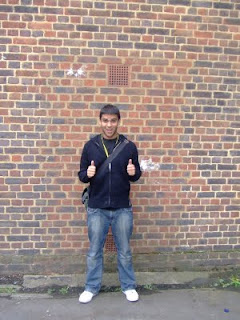
This is the wall we intended to use for the shots of the lead female holding up the signs saying "I Wish" This is myself standing against the wall to see how it would look with somebody standing there.


We found several other locations to use such as Tooting bec common for scenes near the end of Ruth walking through the forest with the animals around her.

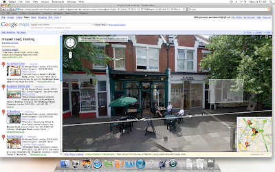
We discussed also using Tooting High street and Southcroft road, We found a cafe which we thought would be perfect to use due to the style of windows it had and the positioning of the tables within unfortunatly after going in and asking their permission the owner refused saying it would dirupt his customers. We had to find somewhere else so looked at other places such as 'Chandlers' which is a cafe on Moiser Road, we couldnt ask permission at the time becuase it was closed.


We planned a day to go out and film on Sunday the 18th of October.


We also used google maps to look up locations without having to go out, here are some screen shots of the places we looked


Tuesday 20 October 2009

Genre Conventions

I looked at the normal conventions for music videos of the genres Indie, Rock, Hip Hop and R&B as these were the genres of music I had available to me to use. I found a lot of this research to be helpful as I hope to apply a lot of the conventions to my own video. Here is a list of some of the normal conventions with examples of bands of the genre.


Indie/Rock:

· Lots of performance by the artist or band.
· If a full band is featured, close up shots of them playing their instruments is usually used.
· Main focus is placed on the lead singer.
· Indie videos can have an abstract element to them
· Some of the rock videos can be seen as rebellious with louder segments of the song synced with some sort of in screen action depicting the change in sound.
· Depending on the gender of the band the mise en scene can vary, usually with an all male band the scenery is darker colours and vice versa for females.
· They usually begin with an establishing shot, possibly of the artist at a distance and then progressively have close ups of the artist throughout.
· The cutting pace of the video usually matches the tempo of the music with a complete change of the on screen action when a solo comes in.
· There is usually not much use of special effects, if any it usually involves green screen with some sort of vast landscape behind.
· Examples of bands: Metallica, Florence and the machine, The Arctic Monkeys, Blink 182.


R&B and Hip Hop:

· In every video I looked at it featured the artist
· The artist is usually shown to be boasting their fame with use of expensive things such as jewellery and cars.
· Usually has a lot of dancing women in it who are very rarely fully clothed.
· There is usually one women in the video who is different to the others who is usually who the song is about.
· Usually a lot of long shots and tracking shots following the artist
· There is not much of a narrative going on as all focus is on the artist and how ‘Glamorous’ they are.
· The cutting rhythm isn’t usually that fast and has a relaxed feel to it and fairly laid back.
· When the artist is a male there is a lot of women features
· When the artist is a female there is mostly focus on her.
· Examples of artists: Akon, 50 Cent, Rhianna and The Game.

Music Video Directors

Michel Gondry:

He is a French film, TV commercial and music video director he has become most famous though his inventive visual style and manipulation of mise en scene. He has produced videos for a wide range of famous bands including rock bands such as The Rolling Stones, The White stripes and Radiohead. He has been a big influence on the music video production of today; he started of his career by producing his first music video for the rock band Oui Oui. He later stared producing films alongside music videos where he imported his techniques into them. He is also very famous for his invention of the idea of ‘Bullet Time’ which was a scene in the famous film The Matrix where time slows to a halt and the camera rotates around the action giving what seems to be an impossible shot.